
The language we use to keep colour in its place
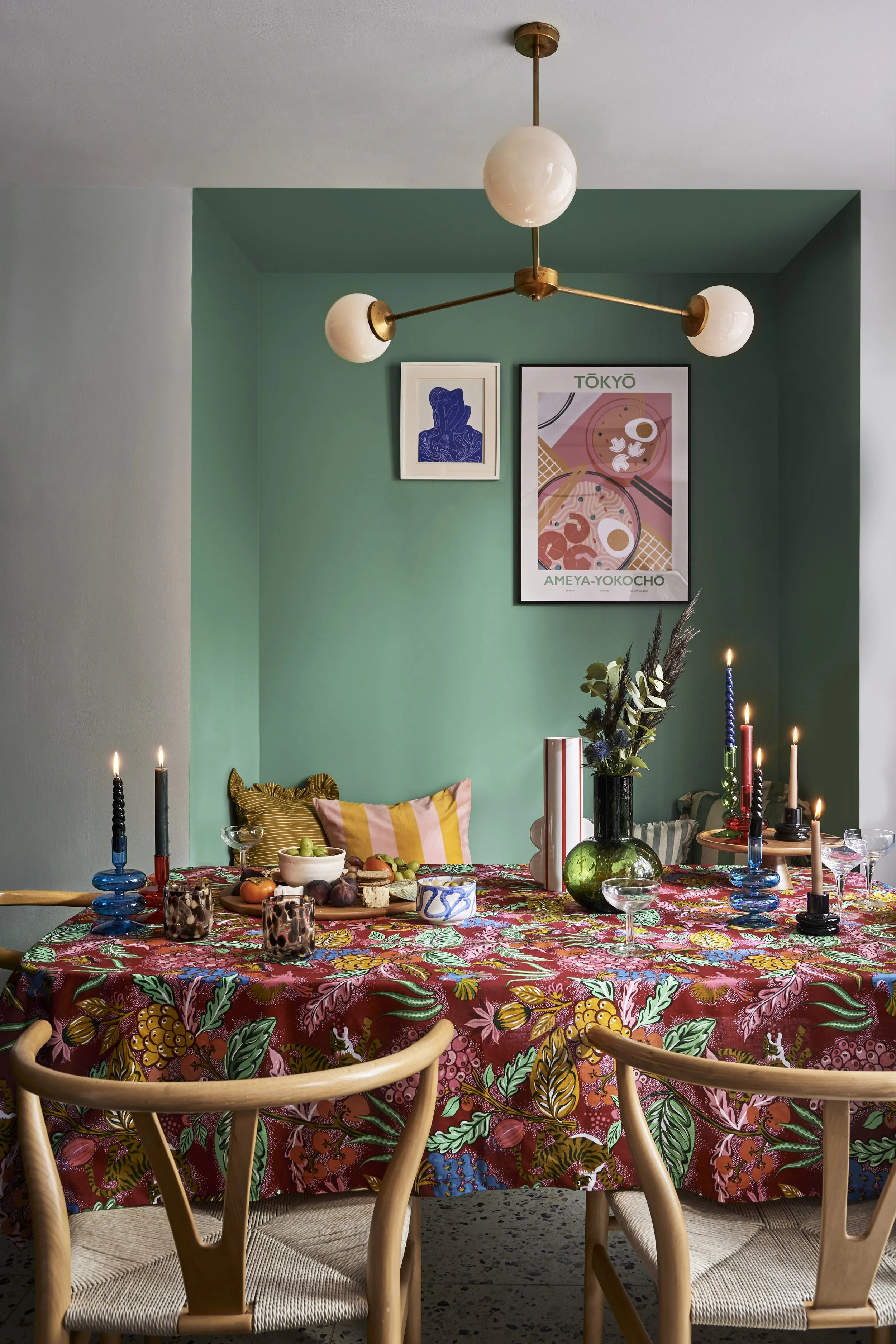
All the colours you could ever wish for to create an inviting buffet-style table for entertaining.
Styled by myself for Dulux
Brash. Garish. Loud. Gaudy.
Just a few of the words commonly used to describe colour that doesn’t sit within a particular definition of ‘good taste’ in the world of interiors. And while taste will always be subjective, my heckles tend to rise ever so slightly when terms like these are used to attach a negative bias to certain shades.
Why?
Because tastemakers hold a lot of power. And when it comes to colour in the home, herd mentality is very real, shaping what is widely seen as acceptable, and what is not.
But if colour, above all else, is emotional, and speaks to each of us in different ways, surely it’s to be expected that we won’t all respond to it in the same way.
Which begs the question: shouldn’t we be more accepting of different expressions of colour, and leave our judgements at the door of someone else’s home?
All good in theory, but harder in reality.
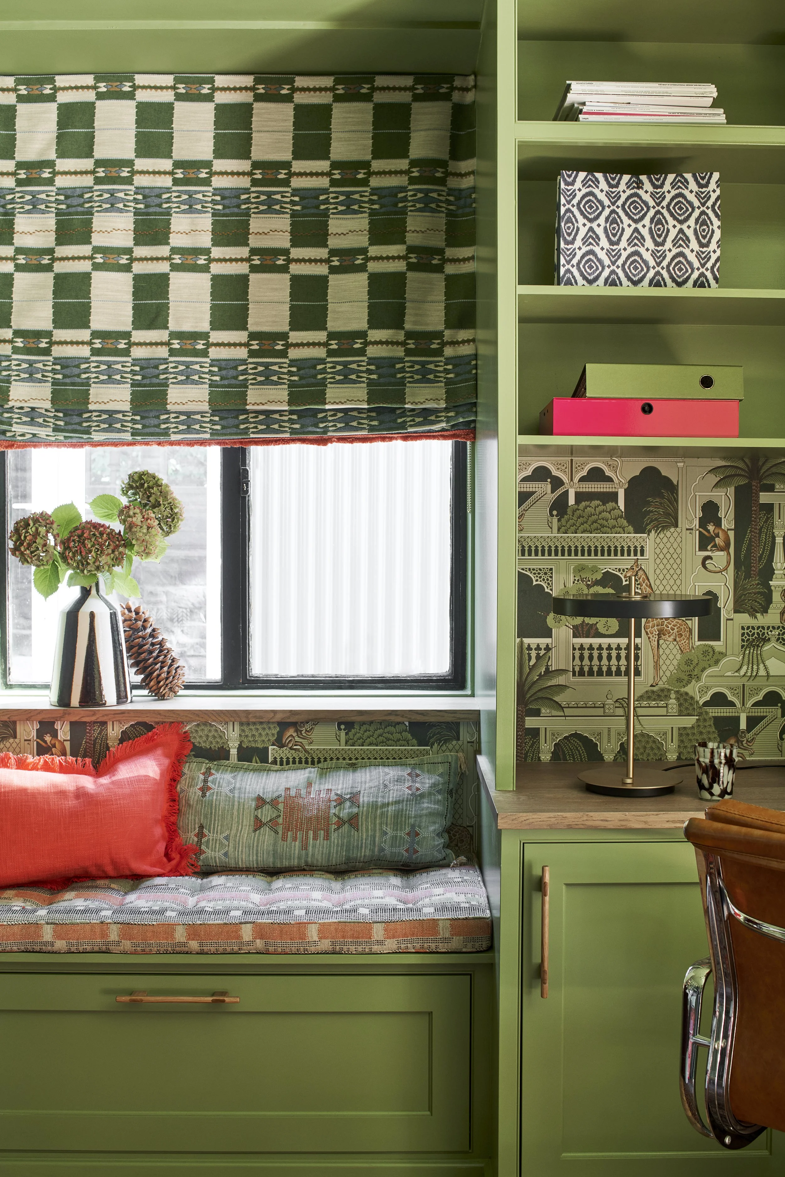
Luckily my client loved green just as much as I do! From the library project.
Recently, a homeowner near me decided to paint the outside of their house a bright, acid yellow. I had to stop myself from vocalising my judgement when I saw it.
Because I did judge it.
“Whoa” was my first thought, followed by a flicker of disappointment that a double-fronted period property had been painted such a vivid shade. But then I caught myself.
Perhaps this colour makes them feel good every time they come home. Perhaps it’s their way of saying, this is my house and I’ll decorate it however I choose. Perhaps they simply wanted something as far removed from grey as possible.
Or perhaps this is the first time they’ve ever painted the outside of a home and didn’t quite realise how bright it would feel once it was up. Perhaps they may even regret it.
But none of that is actually my business. Because it is their home. So who am I to decide whether that colour is too much, too brash, or not right for that type of property?

Loving colour in all its shades, like this soft buff colour for a commercial project in Oxfordshire.
Two things feel certain. Language is powerful and colour is personal.
So how do we begin to notice the unconscious biases that tell us an intense emerald green is too much for a wall, or that hot pink velvet curtains are somehow brash? And at what point do we decide that we simply love these colours, and that if visitors to our homes make snap judgements about our taste, then so be it.
Because if I’ve learnt one thing from all my years working with colour, it’s this. No matter how many experts insist that mouse grey is the only colour you need in your home this year, or hold it up as the epitome of good taste, if you don’t love it, it simply won’t feel good to live with.
And more often than not, that’s when people retreat back to neutrals that feel safe, judgement-free, and quietly acceptable. Which is a shame, because colour can offer far more than decoration alone
So here’s to colour without labels and choosing colour for one reason and one reason alone: because we love it.
Perhaps the problem isn't colour?
Perhaps it's the way we've been taught to think about it.
If you'd like help making colour decisions that feel right for your home, I'd love to help.