
Colour isn't a puzzle to solve
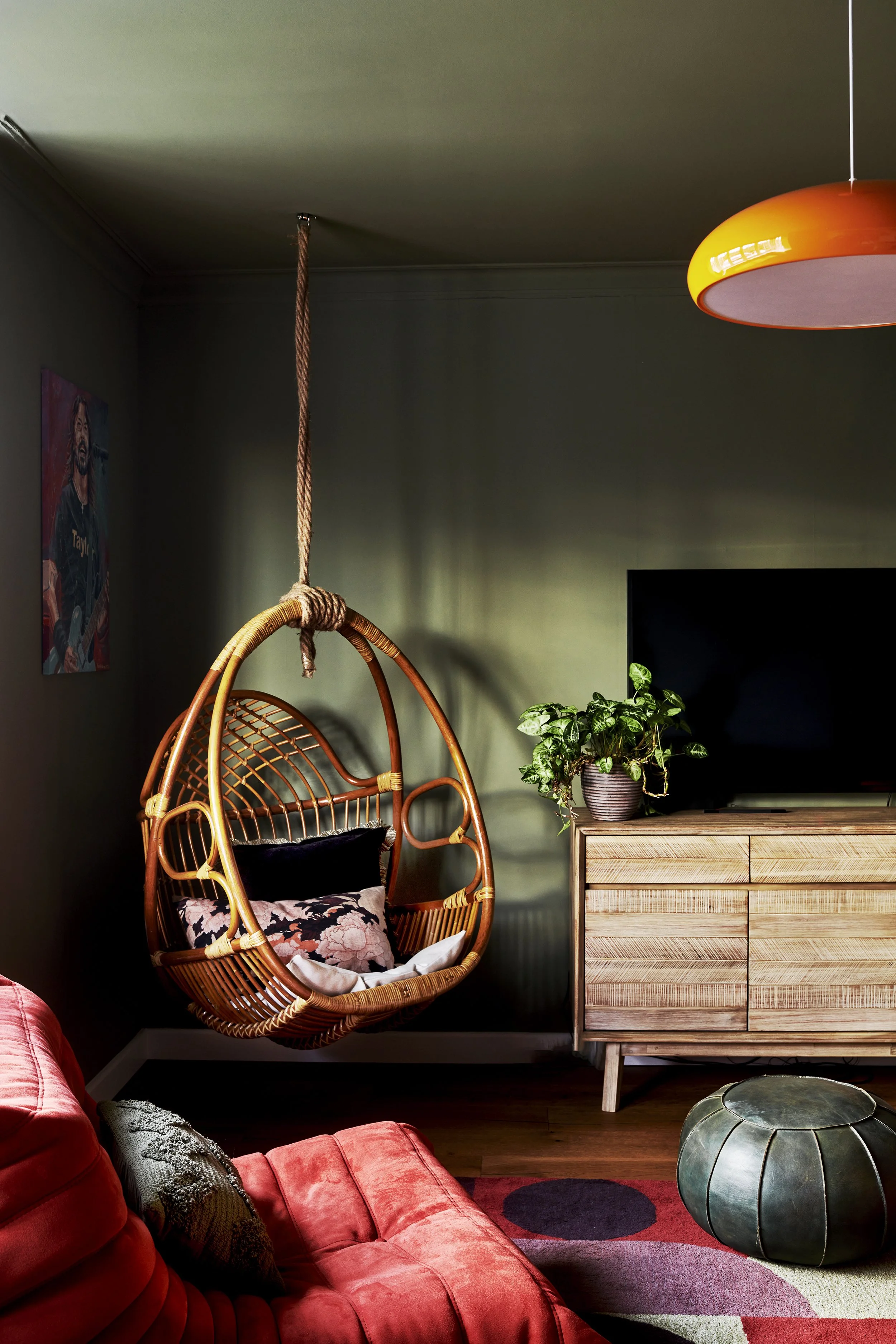
See how colour can feel calm without relying on beige in this West Sussex snug
I wanted to write this because an awful lot of people tell me how hard they find colour.
Mixing it in a room. Knowing which shades to choose. Creating a home that feels cohesive without everything matching perfectly.
But honestly, I think people get far too stuck in their heads when it comes to colour.
Somewhere along the way we've started treating colour as a problem to solve rather than an experience to have.
We analyse it. Research it. Second-guess it. Look for rules. Look for formulas. Look for reassurance that we're making the "right" decision.
But colour isn't really like that.
It's something we're drawn to instinctively. Which means we need to trust our emotional response to it, rather than trying to construct the perfect formula for combining shades throughout our homes.
"That's easy for you to say, Sam."
And yes, colour does come intuitively to me.
I'll admit that.
But I genuinely believe everyone can discover the colours they love—and the colours that feel right together—if they slow down and pay attention to what they're naturally drawn to.
The problem is that we now have far too many references.
Open Instagram and you're presented with thousands of beautifully curated homes. Open Pinterest and there are thousands more.
Combine that with the feeling that our homes are somehow no longer just for us—that they're being judged by visitors, by social media, by people we'll never even meet—and it's easy to see why decorating can feel overwhelming.
Will I like it?
Will I get bored of it?
What if it's too much?
And so we hesitate.
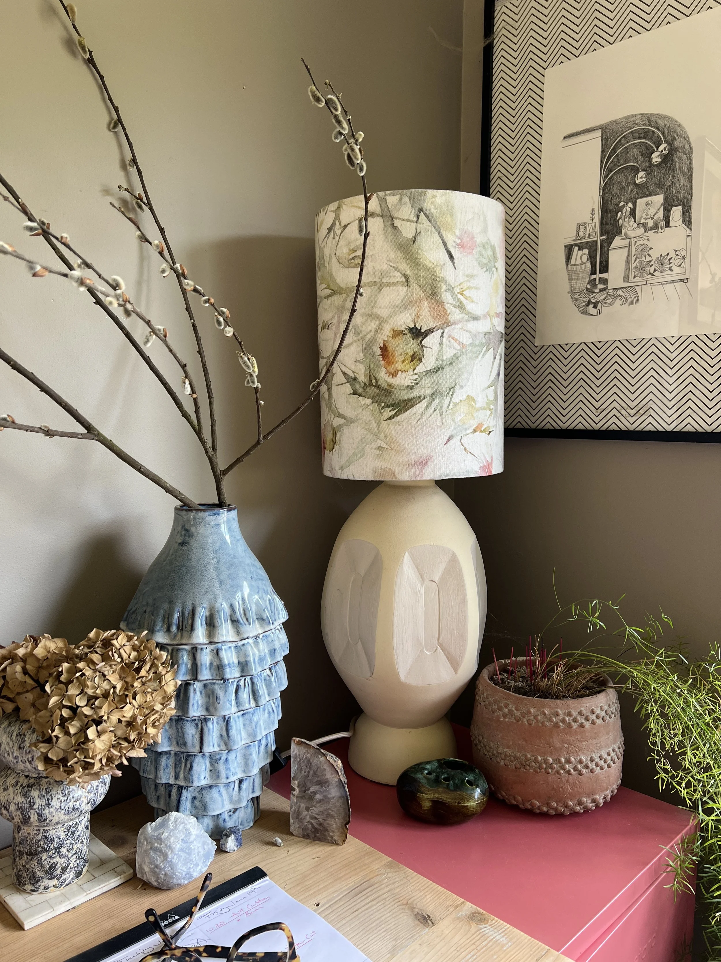
A quiet corner of my home office which looks different throughout the day as the light changes
As I write this, I'm sitting directly in front of a wall painted Rolling Fog Dark by Little Greene.
It's the backdrop to my open-plan sitting room, dining room and kitchen. Whenever I surface for air from my keyboard, it's this colour I find myself staring at while my mind wanders.
It has a stillness that I find calming and depth to it that feels reassuring.
The natural light moves beautifully across it throughout the day.
Is it brown? Probably not. Is it taupe? I'm not sure about that either.
In fact, you might be surprised to know that I often struggle to name colours precisely. Part of me never really wants to.
Clients sometimes expect colour specialists to have an encyclopaedic vocabulary. To know exactly where taupe ends and mushroom begins.
But I've never found that particularly interesting.
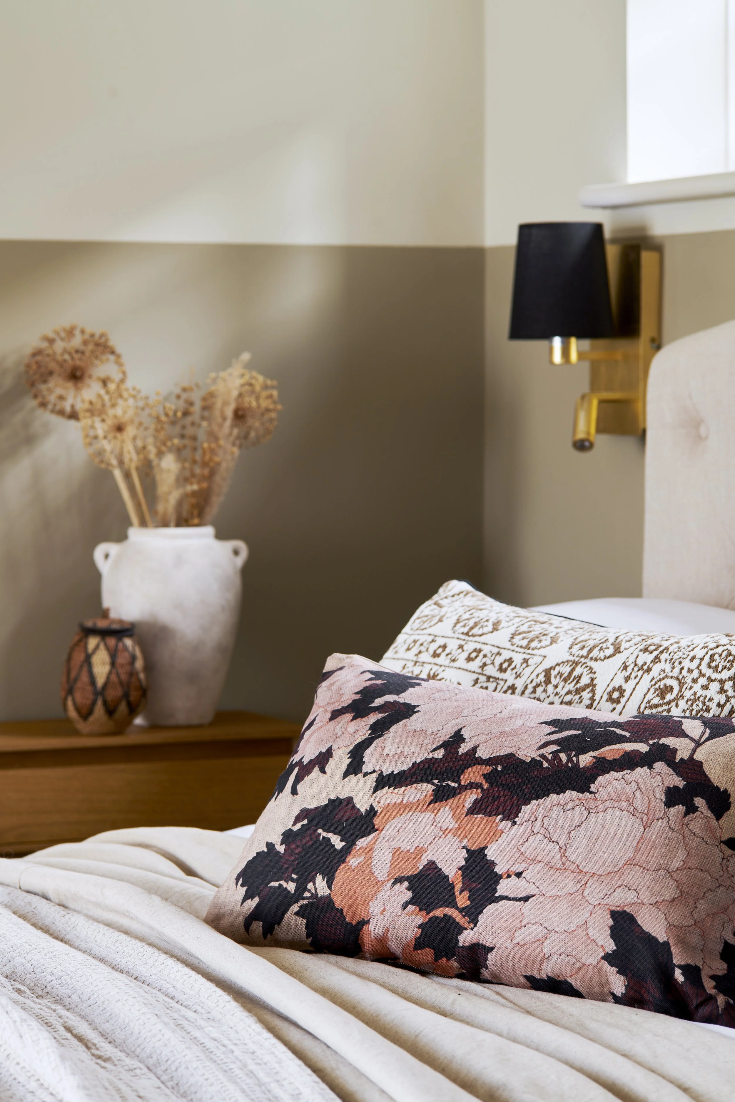
See how colour creates atmosphere in this West Sussex Airbnb
What interests me is what a colour does.
How it makes a room feel.
How it changes as the light shifts.
How it affects your mood.
How it sits alongside the objects, and the people, you live with every day.
Perhaps that's why I think colour labels can sometimes do colour a disservice - they attach assumptions where none really need to exist. And they make us believe we're choosing between categories rather than experiences.
Because colour isn't a puzzle to solve. It's an opportunity to feel something.
Not in a bold, attention-seeking way but in a quieter one.
One that helps you notice why one room feels restful while another feels energising.
Why one colour makes you want to linger and another quietly encourages you to leave.
For all the conversations we have about undertones, palettes and paint charts, I think that's the part that matters most.
Not whether a colour has the perfect name.
Not whether it's technically right.
But whether it feels right to you.
Continue reading
Why Minimalism Never Feels Neutral→
Why trusting your instincts matters more than following colour rules.
Who Are We Decorating For? →
Why the most memorable homes aren't necessarily the most fashionable.
Why I'm Starting to Distrust Perfect Homes →
What years of styling and interior design have taught me about authenticity.
Looking for help with your own home?
If choosing colours or pulling a room together feels more overwhelming than enjoyable, my Design Clarity Session is designed to help you move forward with confidence.
Whether you're renovating a single room or planning a larger project, it's a chance to talk through your ideas, ask questions and gain a clear direction.