
Knowing when to stop
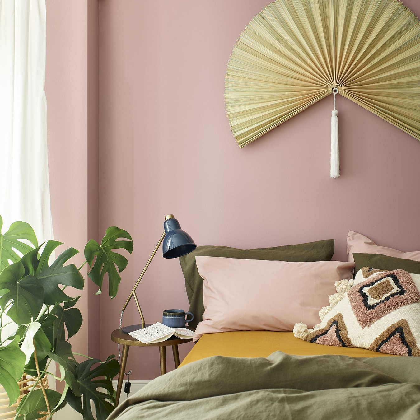
One of my favourite colour palettes - olive green, ochre and soft pink.
One of the harder things about loving colour is recognising when it’s starting to work against a space rather than for it. Not because the colours are wrong, but because there may simply be too many. And sometimes knowing when enough is enough is what separates a home that feels liveable, from one that feels overwhelming.
And I get it. There are so many beautiful colours out there that paring back can feel surprisingly hard. But this step matters, because embracing colour in the home often requires more editing, not less.
Why?
For one thing, a more refined scheme is far easier to work with, especially if you are still finding your feet with colour. Without clear boundaries, a room can quickly tip into the visually chaotic, with every shade competing for attention.
This is often the turning point for people new to colour. The moment when trying to create that perfectly balanced scheme becomes overwhelming, and they retreat back to safer, less risky neutrals.
Which is a huge shame.

Styling a bathroom I designed for a local East Sussex client
So how do you pre-empt that overwhelm, avoid a scheme feeling like it has run away with itself, and create interiors that feel rich with colour yet easy on the eye?
Often it comes down to choosing a clear colour path and committing to it.
When colour feels calm rather than chaotic, it is usually because there is an underlying logic holding everything together. It helps to decide what your leading colour is, and let everything else support it rather than compete.
That could mean starting with a wallpaper that already contains a small family of colours, then echoing those shades elsewhere in the room. Varying tone and depth helps things feel connected rather than over coordinated.
Or it might mean working with neighbouring colours on the colour wheel, so the palette feels related and harmonious rather than full of contrast, blues and greens for example.
In other spaces, a warm neutral such as mushroom, clay or stone can act as a quiet backbone, grounding bolder colours layered on top.
And occasionally, the clearest path of all is to fully commit to one colour. Colour-drenching a room in a single shade can feel far more intentional than introducing lots of separate notes.
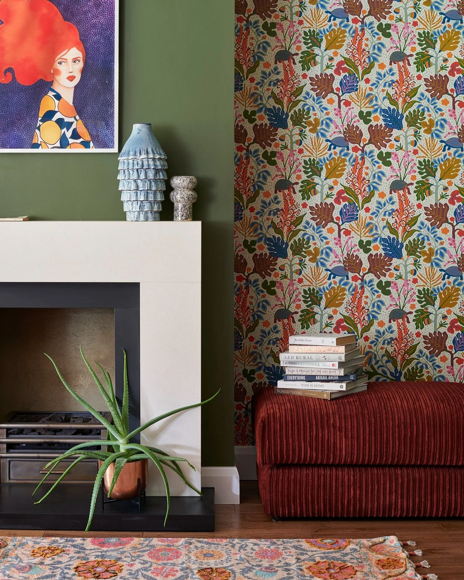
The wallpaper here was the starting point for this living room I designed for my North London virtual clients - and then an overall palette of 3-4 colours were chosen from it for the rest of the space.
Whatever approach you take, what tends to help most is having a sense of intention and then giving your scheme time to settle.
Starting small matters.
It is always easier to add colour later, once you have lived with a scheme for a while, than it is to unpick something that has begun to feel like too much, not quite knowing what to take away, and ending up in a bit of a decorative tizz.
And confidence with colour is rarely something you are born with. It comes through practice, through getting it wrong occasionally, paying attention to how a space makes you feel, and allowing yourself the time to work out which combinations genuinely suit you.
Planning a renovation?
If you're looking for a designer who'll help you create a home that feels deeply personal - not simply beautifully decorated - I'd love to hear about your project.