Calm doesn’t have to mean pale
This West Sussex snug was designed as a retreat for two teenage sisters - somewhere to read, relax, spend time together and occasionally escape the rest of the house.
When people think about creating a calming room, they often instinctively reach for pale neutrals. I don't believe that's the only route to creating a peaceful space.
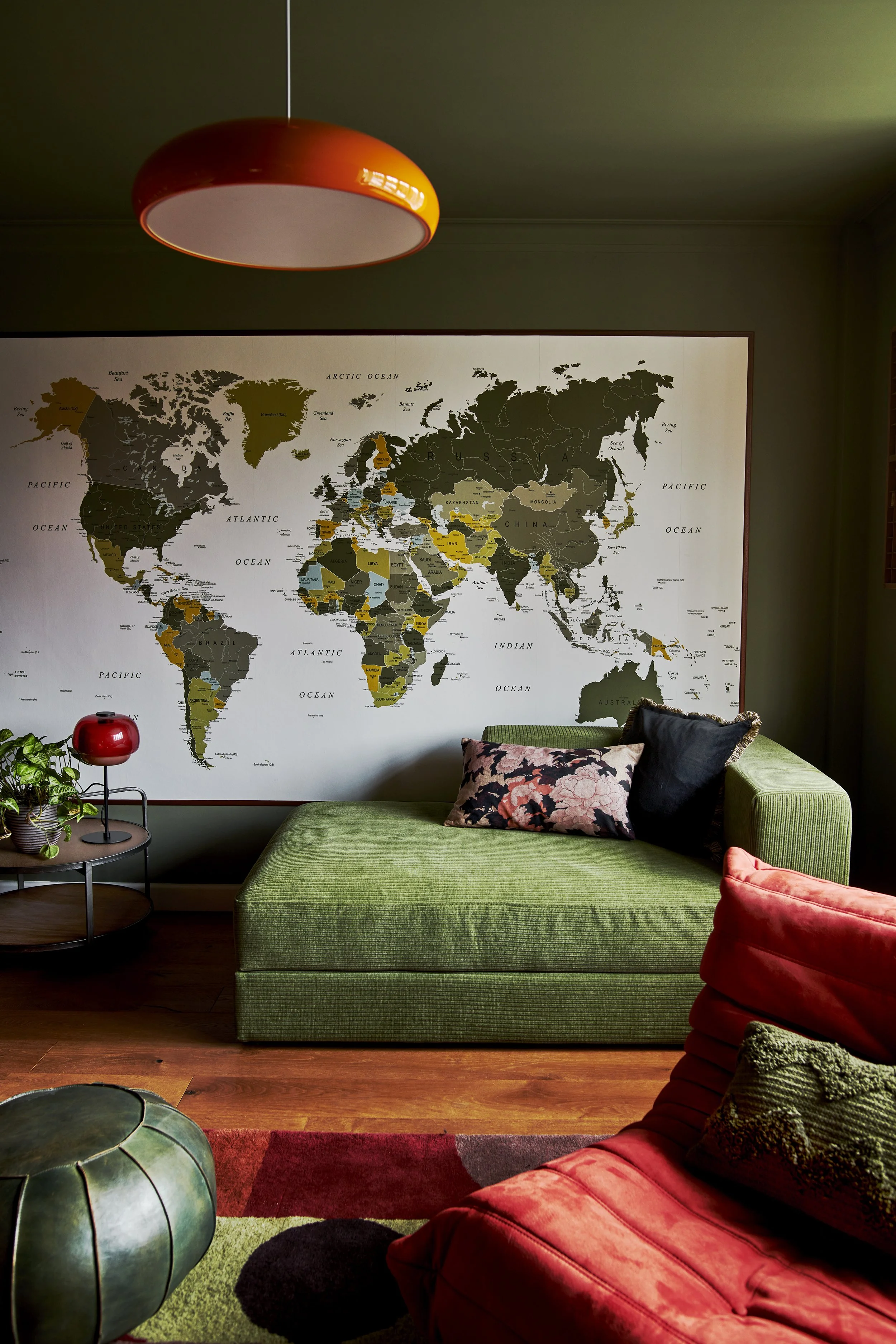
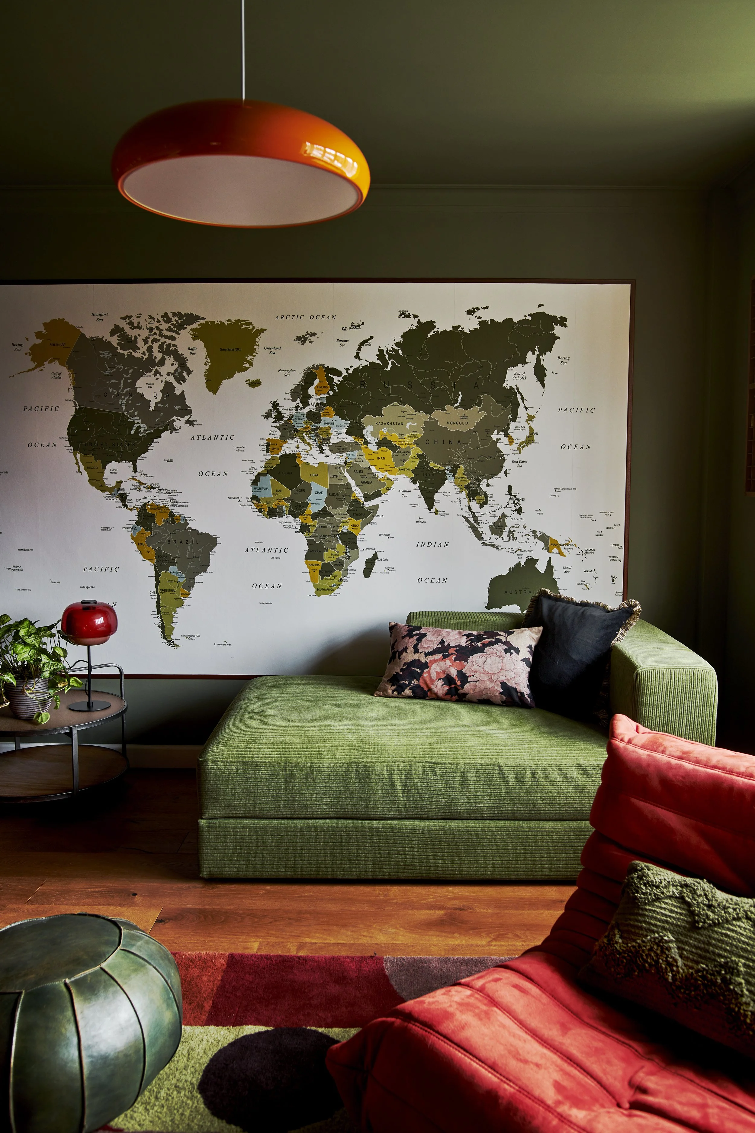
Instead, I colour drenched the walls, ceiling and woodwork in a rich olive green, allowing the room to feel cocooning rather than dark. Against this backdrop, warm reds, terracottas and natural timber bring energy and warmth without competing for attention.
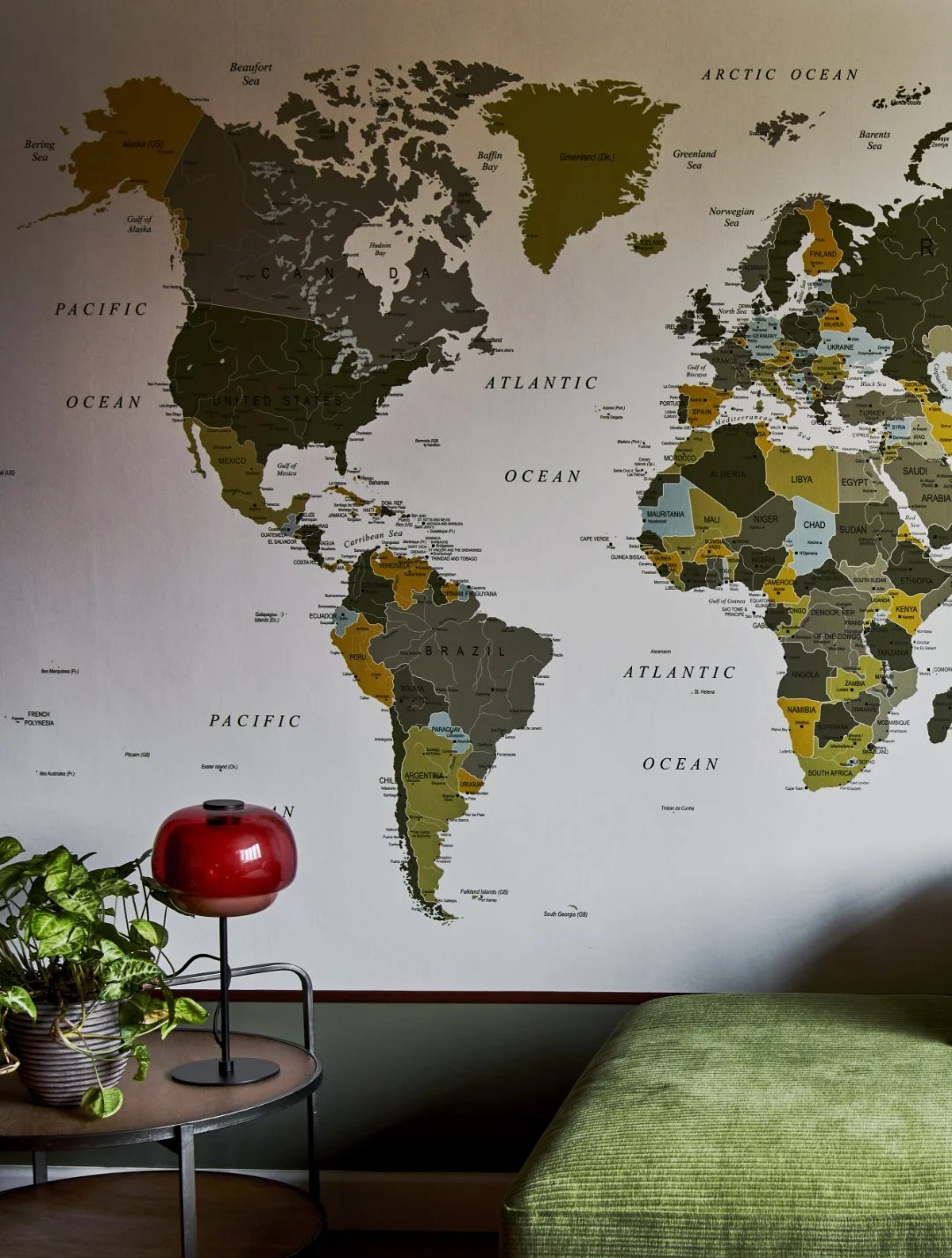
One of my favourite features is the oversized world map, created by framing a wall mural so it reads more like a piece of artwork than wallpaper. It gives the room a strong focal point while quietly reflecting the family's love of travel and adventure.
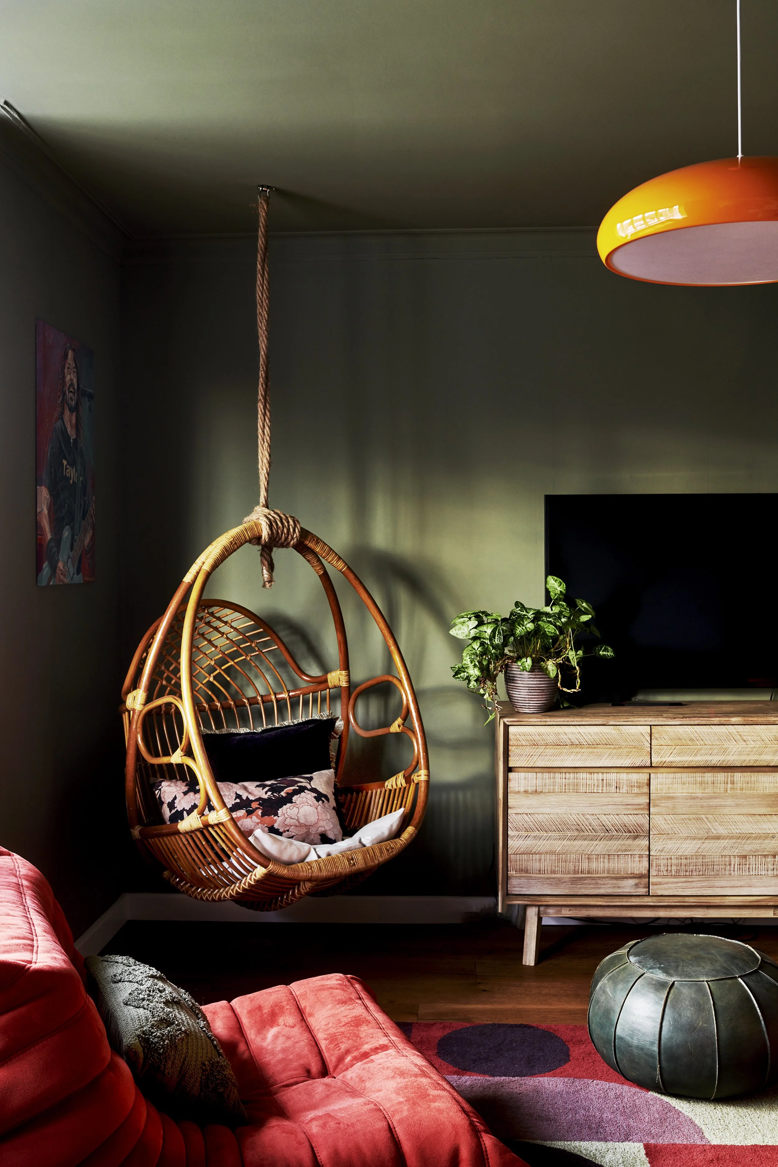
The hanging rattan chair was chosen with the room's younger occupants firmly in mind. More than simply somewhere to sit, it creates a cosy corner to curl up with a book or simply watch the world go by.
It's a room that demonstrates one of the things I love most about colour. Used thoughtfully, darker tones don't make a space feel smaller or heavier. They can do exactly the opposite, wrapping a room around you and creating somewhere that feels both restful and full of personality.