Why every bold wallpaper needs somewhere to breathe
One thing I've noticed over the years is that clients are usually far more comfortable introducing colour than they are pattern.
A richly patterned wallpaper can feel like a much bigger commitment. Will it overwhelm the room? Will they tire of it? Will it be too much?
The answer isn't to avoid pattern. It's to balance it thoughtfully.
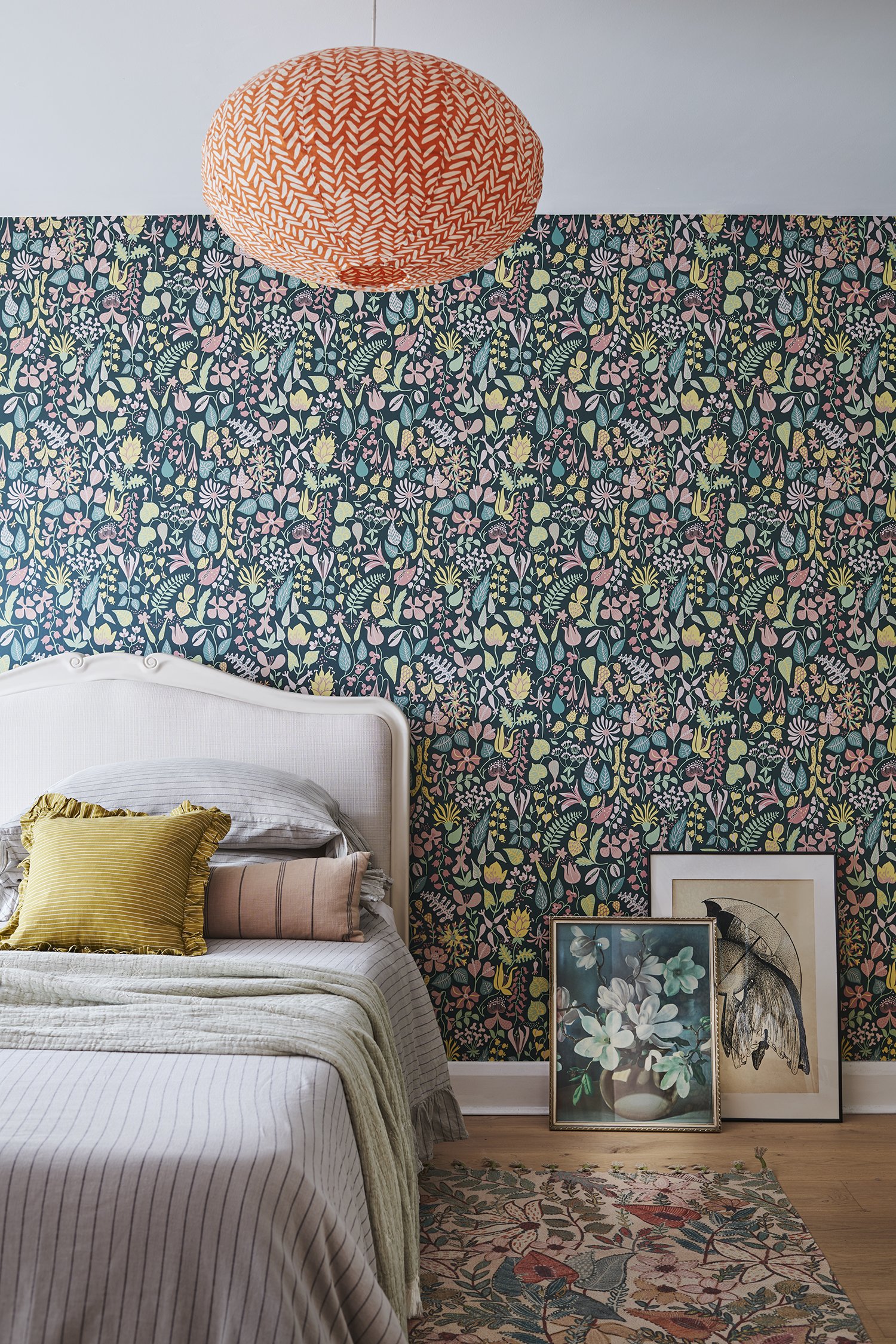
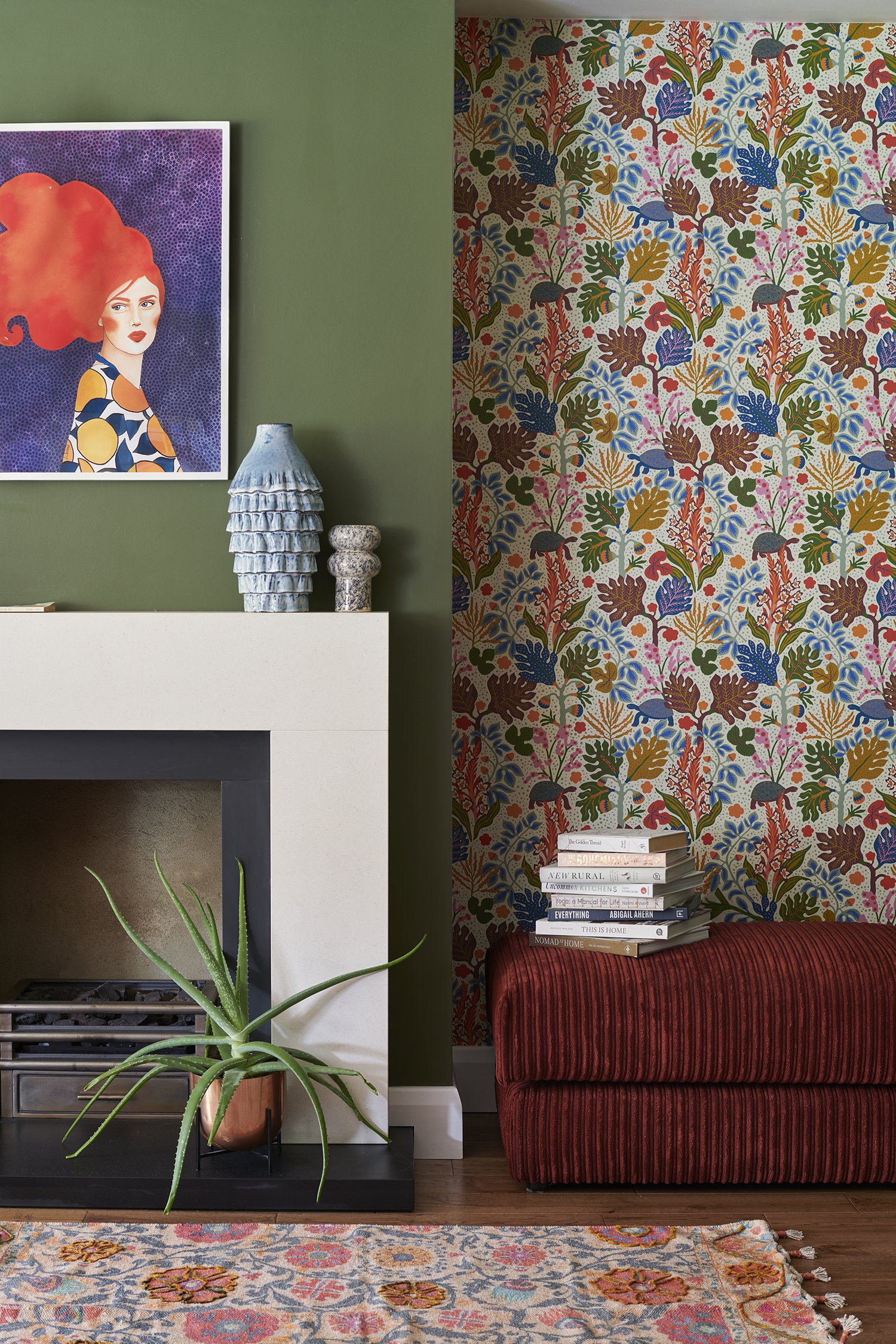
In this home, we introduced two bold wallpapers, each bringing colour, movement and personality to the spaces. Rather than competing with them, the surrounding finishes were deliberately quieter. The soft grey upholstered bed creates a calm backdrop in the bedroom, while the olive green walls in the sitting room give the wallpaper somewhere to breathe.
It's a principle I return to in many of my projects. Pattern brings energy, character and rhythm to a room, but it becomes even more effective when it's paired with moments of visual calm. The contrast allows each element to shine, creating interiors that feel layered and expressive without becoming overwhelming.