Where to look for inspiration for your room scheme…

The seemingly endless paint choices are enough to send anyone over the decorating edge…even for a seasoned interior stylist like myself.
Most people will either turn to magazines or Pinterest when it comes to sourcing ideas for their home. But this isn’t necessarily the best route for establishing your own decorating scheme. For one thing, there is way too much visual choice out there, and so it is very easy to be overwhelmed or confused For another, some of the ideas just aren’t practical when it comes to daily life within those rooms. Don’t get me wrong, I do love Pinterest and Instagram, and am on there every day getting my Interiors’ fix. They are great tools for seeing how people decorate, how different colour combinations work and for showcasing the variety of home furnishing choices available. However, the pictures you see there won’t ever truly reflect you and your tastes, as it will always be someone else’s home that you are looking at. I will always follow my own ‘decorating heart’ as-it-were, as I am the one who has to live with the colour I put on my walls. And so should you.
So the question is, where else can you tap into the perfect room design for you?
For me the best rooms come together organically, inspired by something you already own. Maybe a particular accent colour in a piece of art, or a delicate colourway woven through a rug. Any colours that you find and love this way are already speaking to you on a more subtle level. There is a reason you’re drawn to particular shades and hues. And it’s because you love them. Not because someone half way around the world says they’re the cool colour that you should be painting your walls in.
The rug below by Anthropologie is a great starting point for a room scheme. It will not only be a great point of interest to the room, but has at least four great colours in it that can be used to pull a look together.
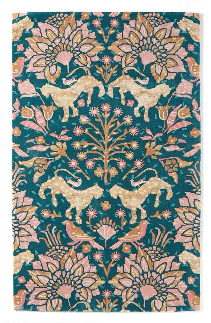
Tufted Mahina rug from anthropologie
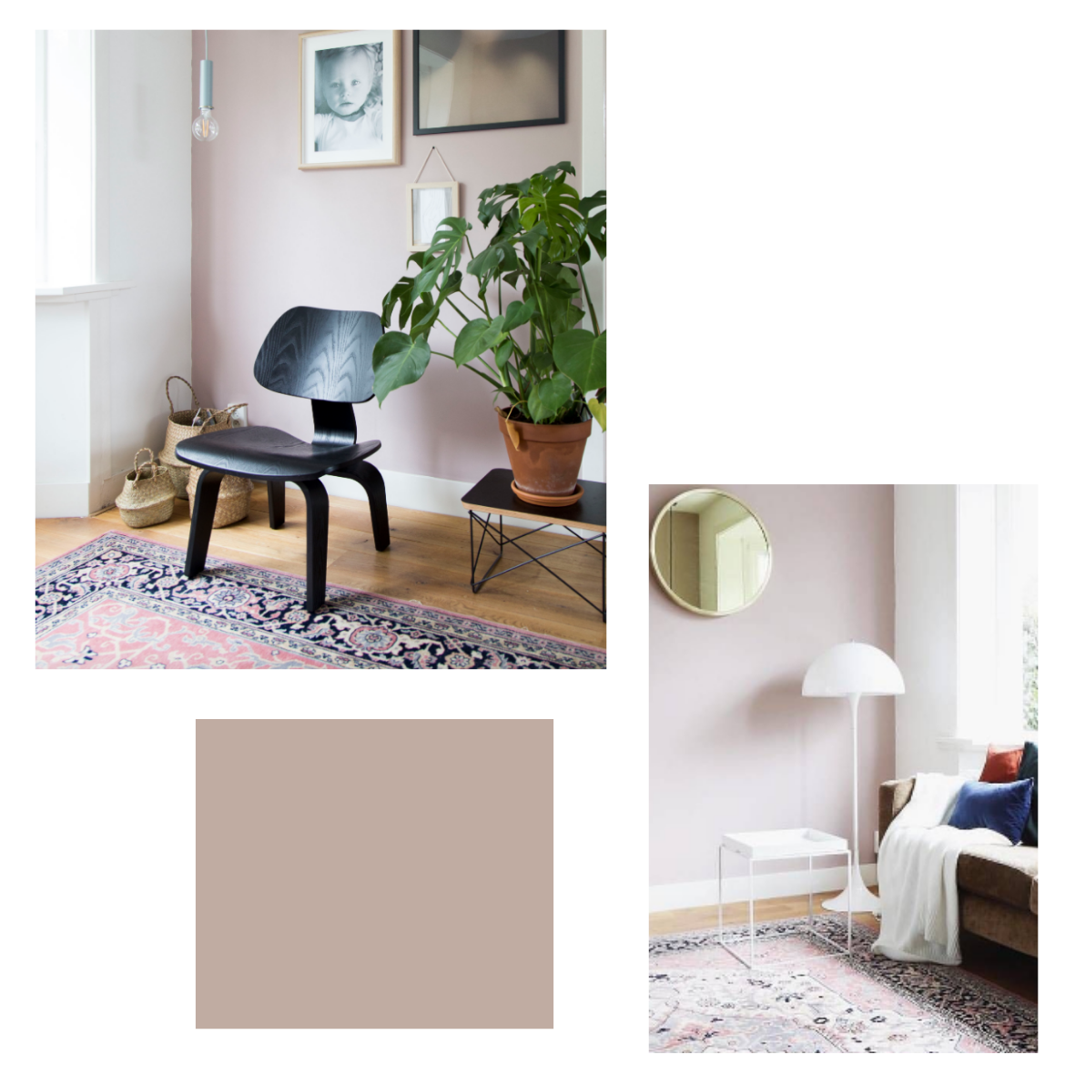
The muted soft pink that runs throughout it could easily become your wall colour. This type of sludgey warm pink makes a great alternative neutral for any room. It also has a darker, almost mauve undertone which will give real depth to any walls it is painted onto. And you needn’t necessarily paint all four walls in this colour. One or two painted walls can equally reinforce your scheme, and this is a great option if you aren’t used to wrap-around colour. A simple off-white for the rest of the room will tie in nicely with the rug, as it has specks of pale white running through it too. That’s the beauty of a rug like this. It’s practically a mood board in itself. And you know that someone artistic is behind the design, and probably spent years studying colour. Hence why it works so well.
Marrit de Lang from the Done by Myself blog has used this type of mauve-based pink beautifully in her home.
Light Peachblossom by Little Green
When it comes to thinking about the other soft furnishings for your room, the one element that also has a major visual impact is your curtains. They tend to take up quite a lot of space after all, especially when drawn at night. The darker blue-green that forms the background to the rug would make a great tonal base for their fabric. And by choosing this colour, you immediately start to draw everything together. The curtains I’ve chosen below are perfect as they are not quite the same colour as the blue-green in the rug, but are almost there. This avoids everything looking too ‘matchey matchey’. It’s your home after all, and not an Interior Design showroom. And don’t be afraid to introduce another pattern into your room. The colours within these curtains are within the same colour spectrum, and the botanical design just adds another nod to Mother Nature. Combining different patterns with the same hues can really up level the look and feel of a space, and layers in a room will always add visual interest.

Aralia ready made curtains by John Lewis
To further pull the whole look together with your accessories, cushions like the following mixed up on your sofa would be perfect.

Combining plains, patterns, textures and even shapes works best with cushions.
Velvet cushion from Mint & May
Bird print cushion from M&S
Abigail Ahern Octopus cushion from Debenhams
Mixing and matching your accessories with different prints, textures and colours stops your interior from looking ‘over designed’. Perfection in the home isn’t relaxing after all. And the cosiest homes feel like the owner hasn’t tried too hard when it comes to their decor.
If I was designing a whole room scheme for someone, I would then start to add more details that stopped the whole look being too co-ordinated. Companies like Maisons Du Monde, Made and HomeSense for example offer a range of furniture and accessories that don’t tick a certain style box.

Ilaria Floor Lamp by Made
This floor lamp reflects the colours in the rest of the room, but at the same time brings a new element to the design with it’s gold finish. And this is the best way to really bring life to a room, by adding plenty of interesting textures and finishes.
And a nest of side tables like these ones from Maisons du Monde will further complement the room, and add a bit more visual interest. The darkness of these tables will create a grounding effect to the area they are in, plus the brass topped one will tie in with the floor lamp above.

Kampala nesting tables from Maisons du Monde
You can mix and match from this point onwards, as this is how you create a look that you love – not one that is a replica of someone else’s home on Pinterest. And don’t forget any vintage pieces, or hand me downs from Granny that you might have lying around. Stuff that when you look at it, or use it, makes you feel connected to someone or somewhere else. After all, a home is only ever a home it feels like it is personal to you.