Colour in the home and why I can’t live without it.
4 minute read
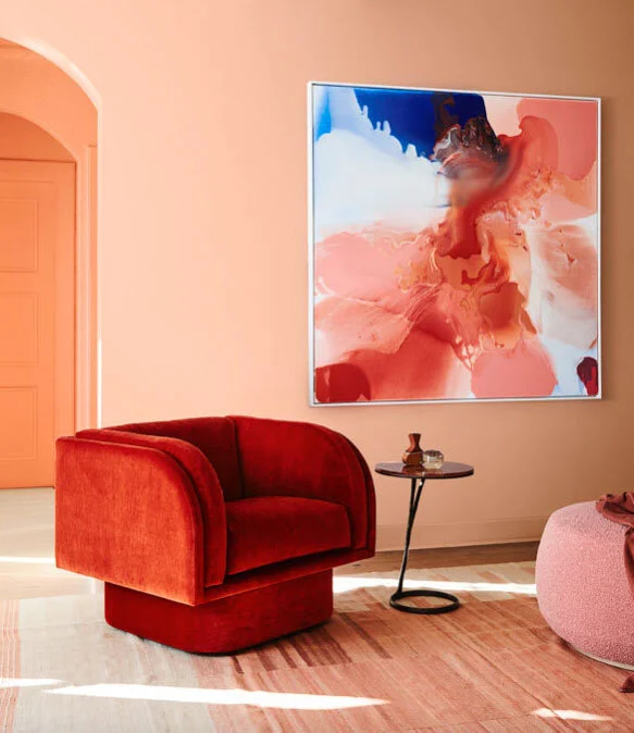
Image credit: www.dulux.com.au
For me, the reason why colour in the home is so important comes back to the natural world. Very few places on this planet are monochrome, and no-one dreams of living in the endless white landscape of the Arctic. As human beings we need colour in our lives. It stimulates our senses and sparks our emotions. Nature has surrounded us with her colourful hues since the moment we came into existence. Therefore I believe we need colour in our interiors to really feel at one in our home environment.
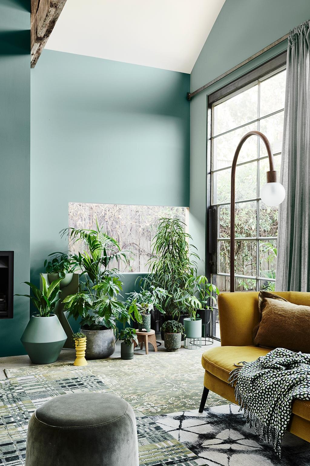
Image credit: www.dulux.com.au
As a stylist it is my job to play with colour and shape, to create visually stimulating interiors. And it’s not just about your wall colour. The most authentic, natural looking interiors are those with layers of colour – whether that colour comes from the tone of wood of your dining table, the exact shade of yellow woven into a throw, or the particular grey hue of your sofa.
I’m not advocating painting all four walls in a hot pink or citrus yellow. Far from it. Colour needs to make us feel good; to speak to us softly, to make us feel relaxed in our own homes. The rest of the world is manic enough, without having explosions of colour bombard us as soon as we walk through our front door.
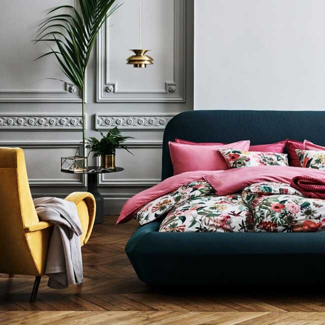
Image credit: www.hm.com
A muted shade like the delicate grey in the bedroom above is a great starting point to step outside the traditional ‘white box’. A pale grey like this one is very versatile. And it works well with many other colours you might not have considered…bolder hues that act as little bursts of colour.
The deep green shade of the upholstered bed sits beautifully against the softness of the grey wall. The green is then referenced directly with the luscious palm and, on a more subtle level, in the green of the patterned bedding. And by including the deep pink and umbra yellow into the room, you add more accent colours to give the room a depth through its’ layers of colour. This space looks calm and inviting, and that is a direct result of the colours it has been painted in and styled with.
When I’m styling a room, I will always have a base colour in mind to start with. This base colour will come from something within a room that has visual impact…generally something that takes up a reasonable amount of space. This could be the wall colour, but it could equally be the sofa, a large rug or a piece of art.

Image credit: Pinterest
In the image above it was probably the wall colour that was chosen first. This may have been inspired by the subdued, deep tones of the art, which has similar undertones to the wall colour – even though there is no green at all in the painting. The blue hues in the picture inspire the colour of the desk, which becomes almost invisible against the green wall simply because it is a similar hue to the painting. However, the element in this room which really gives it character, is the bright red chair. It is an unexpected colour pop that makes the space come alive. And by including a muted tomato red desk lamp, and the pop of burnt orange in the flower, you have the magic number of three similar coloured objects forming a visual triangle. This is calming to the eye, as the space is balanced beautifully.
You can see how by choosing a couple of other colours that are a completely different hue from your wall colour, you can easily create an interesting space full of depth. And it is these colour pops that help us to create styled ‘vignettes’, smaller areas within a space that are more curated – that draw the eye to them. And it is by layering colour like this in a room, that you stop it from looking bland.