Colours of the Year 2024
5 minute read
Peach Fuzz, Sweet Embrace, Nude in Nizza and Blue Nova, to name but a few, are all the Colour of the Year for 2024 depending on where you get your interiors’ fix.
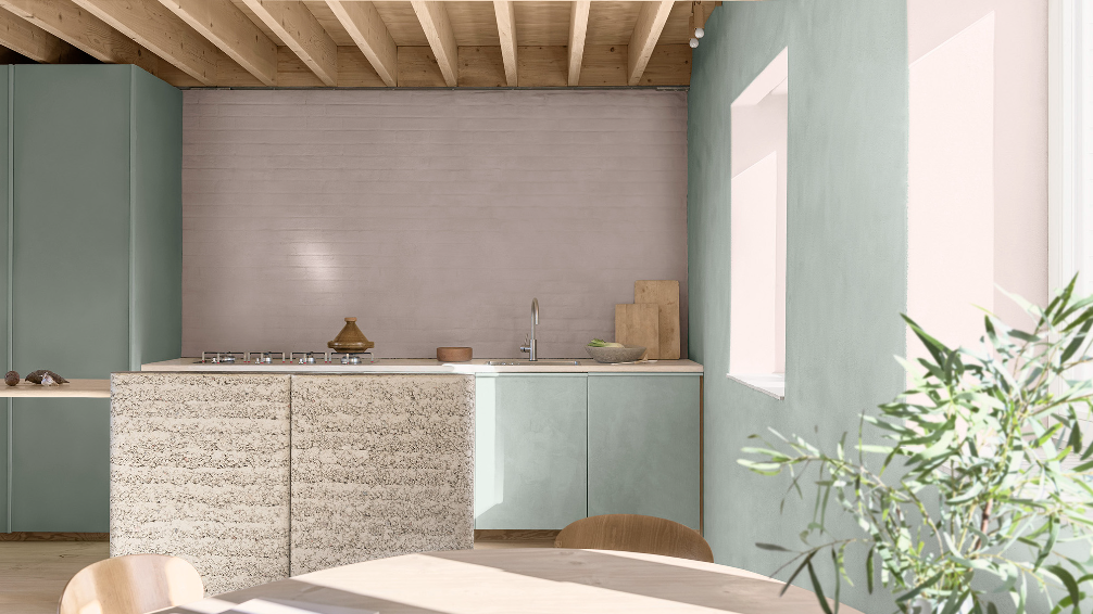
Sweet Embrace, Dulux Colour of the Year 2024, seen here on the back wall.
And whilst the cynic in me (and you) might assume it’s simply a marketing tool to get people to buy more paint, I do believe that there is a real love of colour in the home that most people working for paint companies do actually want to share. Your wall colour isn’t going to solve any difficult issues you have in your life, but surrounding yourself with colours that make you feel good will always have a positive impact on how you feel at home.
Many studies involving the psychology of colour have shown that human beings are not only emotionally affected by colours, but physiologically as well.
With certain colours being known to increase or lower our heart rates, and others to increase or lower our metabolisms. Which suddenly makes the paint colours we put on our walls seem ultra important when it comes to how we feel at home.
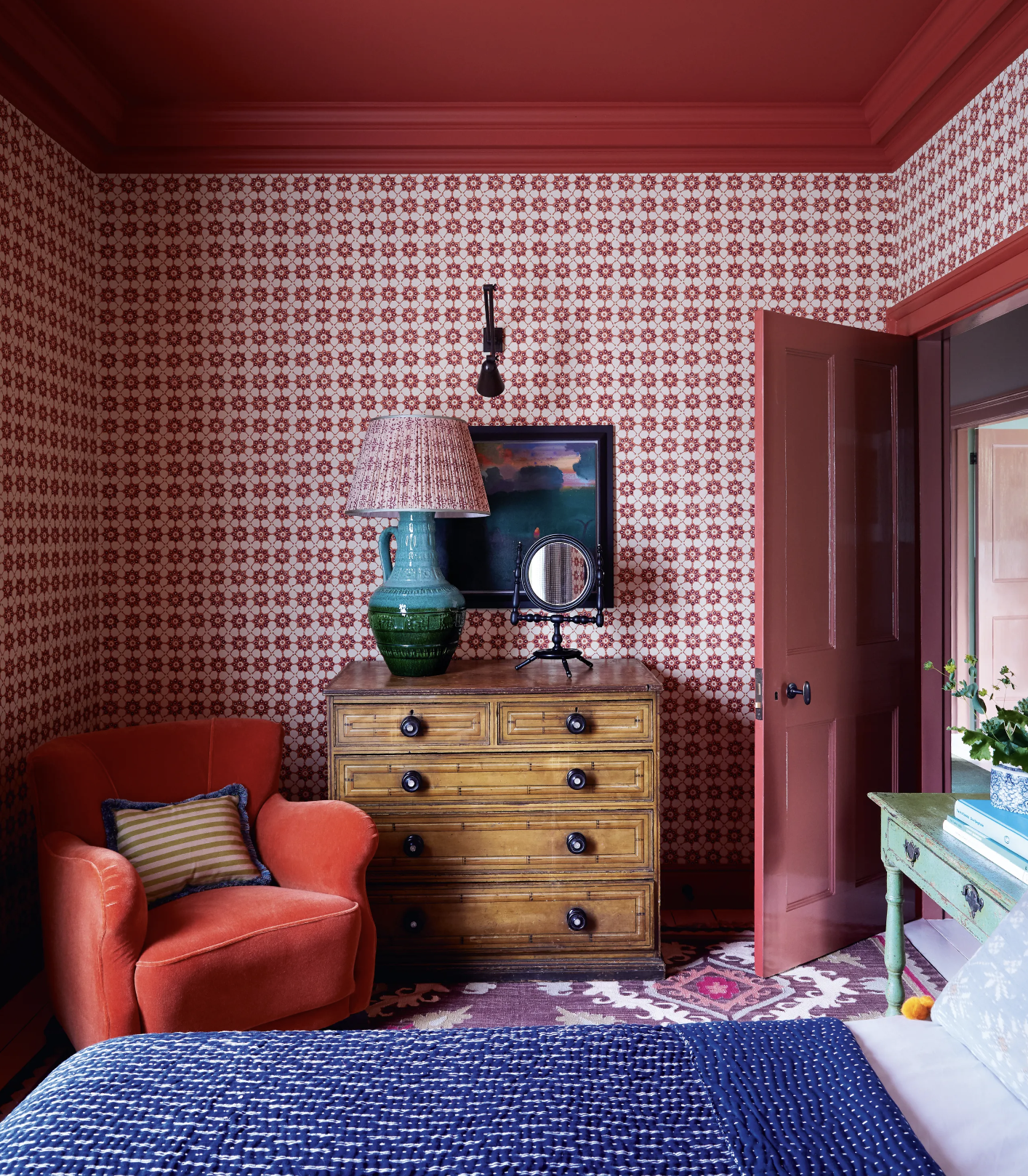
Red is thought to increase our heart rates, so whilst this room by Nicole Harding Interiors might not be great for yoga it has a very playful energy about it that feels both creative and uplifting.
So the offerings of various companies with their ‘COTY’s’ as they’re known (Colour Of The Year), is more an opportunity for us to question how our rooms are making us feel - and whether the colours within them are impacting our physical and mental well being - in either a negative or positive way. But rather than rushing out and re-painting our walls in the latest COTY, the point is more to consider our surrounding colours carefully, and think about how we can use colour to create a relaxing yet inspiring mood within our homes.
Because our homes are our safe havens after all.
And whilst the odd pop of bold, intense colour can be very useful to add energy to a space wherever that might be needed, it’s more often a calm balance of harmonious colours that feels most stable emotionally.

Blue Nova, Benjamin Moore Colour of the Year 2024.
And harmonious doesn’t necessarily mean that all your colours need to seemlessly blend into one another. But more that the colours you choose work together to enhance one another, rather than fighting against each other.
Take for example the blue joinery and wall above combined with the burnt orange chair. Whilst blue and orange have very little in common, they do sit opposite each other on the magical colour wheel…which is why they’re known as complementary colours because they bring out the best in each other.
The blue works to tone down the intensity of the orange chair, whilst the chair brings warmth to the blue colour. So they sit effortlessly together.

Peach Fuzz, the Pantone COTY for 2024 - a little too peachy for a lot of us maybe?
The peachy room above may feel a little too nauseous for a lot of us, but a soft pale peach on your walls can make for a very adaptable backdrop in your home as it sits well with both blues and greens. So an olive green sofa for example would look beautiful against a soft, barely there peach wall. As would a grey blue sofa.
And if you imagine this room in a stark white, I’m sure you can see how that wouldn’t feel quite as inviting as the peach . Because shades of orange are known to feel friendly warm and genuine. Unlike pure white which is perceived as more cold and clinical.

Nude in Nizza by Tikkurila paints - a more liveable version of Peach Fuzz.
And the key thing that all of these Colour of the Year paint shades do, is to ask us to question our go-to wall colours…and maybe try something new.
So if you’re looking at your walls wondering how they might be affecting you, what are the traits that colour psychology associates with certain hues?
Yellow: optimistic, hopeful and mentally stimulating.

Yellow: traditionally seen to bring warmth and joy to a space but also known to spark creativity in the mind. Yellow supposedly allows us to come up with innovative ideas if the correct hue is chosen. Although bright yellow can ultimately have the opposite effect - with long term exposure causing us to feel anxious. So stick to warmer, earthier yellows if you want to enable feelings of calm in your home and need to come up with some original ideas.
Seen here in the home of Paul Firmin & Niko Dafkos.
Blue: calm, meditative and easy on the eye and mind.

Like being at the bottom of the ocean, a deep wall-to-wall blue is felt to be both thoughtful and still at the same time. Many cultures throughout time have also revered this colour for it’s association with the sky above us, and therefore the heavens. So blue is felt to have a spiritual connection too.
The rarest colour in nature, studies have shown that blue causes the brain to release serotonin, which can help to regulate our moods, appetite and sleep.
Seen here in Domino mag.
Green: grounding, soothing and contemplative.
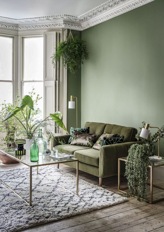
The varied layers of different greens here lend a peaceful air to this sitting room, which is why soft green in particular is perfect for the rooms in our homes that we need to feel quiet in.
And of all the various colours that we can see as humans, green is known to be the most restful and relaxing on the human eye. Which is why many hospitals use pastel greens as their main colour in their wards, as it is known to lower levels of anxiety.
By Sofology.
There you have it. Colour has been scientifically proven to have an effect on our body and our mind…and if that’s not a reason to think carefully about the paint shade you put on your walls, I don’t know what is. But, as with all things in life, colour is intensely personal, and my associations with yellow are likely to be completely different to yours.
So the moral of this story is to dig deep into how certain colours feel to you before you go anywhere near a paint chart. That way hopefully you’ll create a backdrop for your room that feels exactly the way you need it to - whatever your emotional requirements.